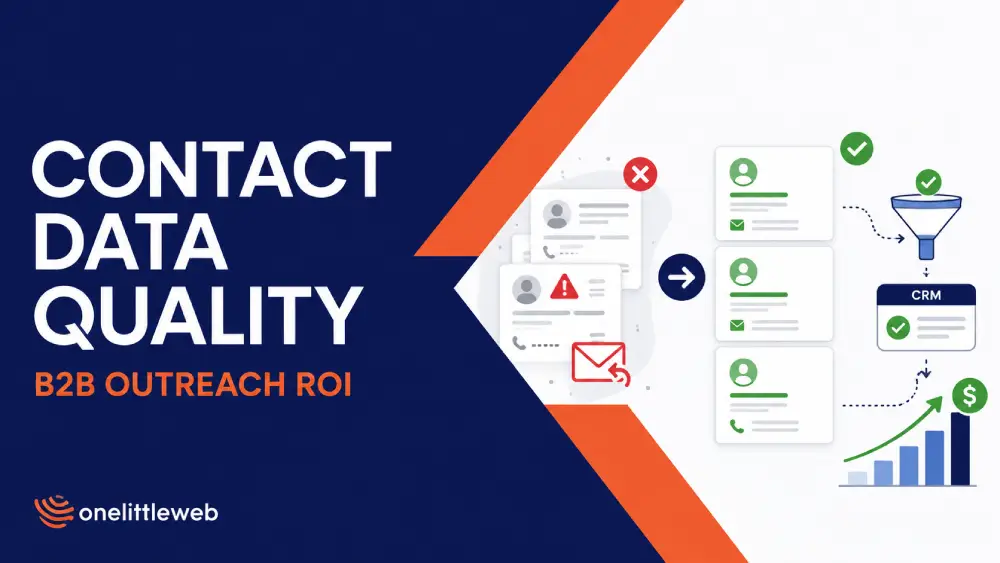
An agency sends 10,000 cold emails. Two hundred replies come back, a 2% reply rate, and the copy gets blamed. Rewrite the subject line. Tighten the CTA. Try a new angle.
None of that helps if 1,300 of those addresses were dead on arrival and another 700 belonged to people who’d already changed jobs.
The copy wasn’t the issue. The list was, and nobody thought to check it before blaming the message. Most of your outreach ROI is decided before a single email goes out, and “the list was mostly fine” stops being good enough once you’re running it at agency scale.
Gartner puts the average cost of poor data quality at $12.9 million a year. HubSpot’s research suggests B2B contact lists decay by roughly 22–30% annually.
Neither number is agency-specific, but for an agency, that cost lands closer to home: wasted credits, hours spent re-verifying a list that should’ve been clean, a client asking why the reply rate dropped when nothing about the campaign changed.
Let’s get into it.
Your Outreach ROI Starts Before the First Email Is Sent
Outbound teams often treat data quality and messaging as separate issues, but one directly affects the other. Your subject line, personalization, and sequence only matter for contacts who are still relevant and reachable.
A list of 10,000 records is rarely 10,000 usable prospects. Some people will have changed jobs, some records will no longer match the ICP, and some contact details will simply be outdated. You still pay for those records, but they never had a real chance to convert.
That distortion carries through the campaign. Reply rates look lower, SDRs waste time following up on bad records, and reporting can make messaging look weaker than it actually is.
So before changing the copy or sequence, check how much of the list was genuinely usable at the time of outreach. That gives you a much cleaner view of what is actually affecting performance.
What Does “High-Quality B2B Contact Data” Actually Mean?
Ask most people what makes a contact database good and they’ll say something like “the emails work.” That’s not wrong, exactly. It’s just answering a much smaller question than the one that actually matters.
A valid inbox tells you almost nothing about whether the person behind it is worth reaching. Data quality breaks down into five separate questions, and most vendors, and most articles about vendors, only really answer one of them.
Accuracy
Accuracy is the most basic question: does the field reflect reality right now, not whether it was correct the last time someone checked.
A phone number that connects is accurate. A title that matches what’s on the person’s LinkedIn is accurate. This is the baseline, and it’s the one everyone markets against.
Freshness
Accuracy has a shelf life. People change jobs, get promoted, leave companies, switch phone carriers. A record that was accurate six months ago can be wrong today without anyone touching it. Freshness is about how recently a record was verified, not whether it was ever verified at all.
Completeness
Do you have enough to actually act? A verified email with no title, no company size, and no seniority signal is hard to personalize against and harder to route to the right sequence. Completeness is what turns a contact into something a rep can use.
Relevance
This is the one nearly everyone skips. A record can be accurate, fresh, and complete, and still be useless, because the person doesn’t fit your ICP.
Right industry, wrong seniority. Right title, wrong buying authority. Relevance is a fit question, not a data-hygiene question, and it’s where “technically valid” and “actually useful” split apart.
Contactability
Contactability asks something different: can this person actually be reached through the channel you’re planning to use?
A personal Gmail address might be accurate and current and still be the wrong way to reach someone who only checks their work inbox.
Contactability is channel-specific, and it’s easy to overlook when you’re only checking whether an address bounces.
Deliverability, the thing most data-quality content actually talks about, only covers the first and last of these. The other three are where most of the wasted spend is hiding.
The Quiet Math Behind Bad Contact Data
Go back to the campaign from the intro. Ten thousand records purchased, 200 replies, a 2% reply rate that got blamed on the copy. Walk the same list through a funnel instead of a single ratio, and a different story shows up.
This isn’t a report of real client numbers. It’s an illustrative model, built the way you’d want to build one before scaling a campaign. The point is the method, not the specific figures. Swap in your own numbers, and it works the same way.
| Stage | Contacts remaining | What drops out |
|---|---|---|
| Purchased records | 10,000 | — |
| ICP-matched | 9,500 | 500 never fit the target profile |
| Current role/company | 8,800 | 700 changed jobs since the record was last touched |
| Deliverable email | 7,500 | 1,300 addresses dead, invalid, or hard-bouncing |
| Actually delivered | 7,300 | 200 soft bounces, catch-alls, spam-filtered |
| Replies | 200 | — |
| Meetings booked | 40 | — |
Run the reply rate against the number everyone actually used, 10,000, and you get 2%. Run it against the number that was ever going to see the email, 7,300, and it’s closer to 2.7%.
That’s not a rounding difference. That’s the gap between “our messaging underperforms” and “our messaging is fine, our list wasn’t.”
Two numbers worth tracking instead of “list size”
- Usable Contact Rate
(ICP-matched + current-role + reachable contacts) ÷ total contacts acquired
In the example above, that’s 7,500 ÷ 10,000, or 75%. A vendor selling you 10,000 records at a 75% usable rate has actually sold you 7,500 prospects and 2,500 units of overhead you’re still paying credits for.
- Effective Contact Cost
(sourcing cost + verification cost + cleanup labor) ÷ usable contacts
Say sourcing those 10,000 records cost $700 in credits, and someone spent a few hours re-verifying and cleaning the list, call it $300 in labor.
Total spend: $1,000. Divided by 7,500 usable contacts, that’s about $0.13 per usable contact, not $0.07 per credit, which is what the pricing page would tell you.
Push it one step further and divide the same $1,000 by the 40 meetings that came out the other end: $25 per meeting, before any sequencing tool, SDR time, or ad spend gets added on top.
None of this shows up if you’re only tracking cost per credit or cost per contact acquired. It only shows up once you follow the list all the way to the bottom of the funnel, which is exactly the step most data-quality content skips.
That’s also where a contact enrichment platform earns its keep: verifying a contact in real time, at the moment it’s retrieved, keeps a chunk of that 2,500-contact overhead from ever entering the funnel in the first place.
Five Ways Bad Data Eats Into Outreach ROI
Bad contact data does more than reduce the number of people who see a campaign. It raises costs across sourcing, sales time, deliverability, personalization, and reporting.
1. You pay for contacts you cannot use
Every credit spent on the wrong person, a stale role, or a dead address raises the real cost of the list. That waste rarely appears as a separate expense, which is why cost per usable contact tells you more than the price per credit.
2. SDRs spend time fixing records
Someone has to catch the bounce, check the title, or confirm whether the contact still works at the company. At scale, those small checks can take up a meaningful share of an SDR or researcher’s time.
3. Poor lists can hurt deliverability
Hard bounces do not only affect one send. Repeated list-quality problems can weaken sender reputation and make future campaigns harder to deliver reliably.
4. Bad fields weaken personalization
Personalization depends on accurate data. A stale job title, wrong company, or incorrect seniority field can send a contact into the wrong segment or make otherwise solid copy feel irrelevant.
5. Reporting becomes harder to trust
Once bad records enter the CRM, campaign metrics inherit the same noise. Reply rates, conversion rates, and pipeline figures can all be measured against contacts that were never genuinely usable.
That is why poor data often shows up indirectly: in wasted time, higher costs, weaker deliverability, and performance reports that do not fully reflect what happened.
What Lead Generation Agencies Get Wrong About Data Quality
Everything so far applies to any team doing outbound, from SDR teams booking demos to SEO teams running blogger outreach for links. Agencies have a version of this problem that’s harder, because they’re managing it across multiple clients, multiple lists, and multiple sets of expectations at once. A few patterns show up often enough to be worth naming directly.
Optimizing cost per lead instead of cost per reachable lead
Cost per lead is easy to put in a proposal. It’s also the wrong number to optimize, because it treats every lead as equally valuable regardless of whether it converts to a usable contact.
An agency that wins on cost per lead and loses on usable contact rate is quietly delivering worse outcomes at a price that looks competitive on paper.
Buying database size instead of ICP coverage
A bigger database is not automatically a better one. A provider with 850 million profiles may still be a poor fit if your ICP is a narrow segment and only a small share of those records match it. What matters is coverage within your target market, not the total number of profiles.
Trusting a vendor’s “95% accuracy” claim without asking what it measures
Accuracy claims are hard to compare because vendors often measure different things. One may be referring to syntax and MX checks, while another may mean the email was valid when it was last verified. Before comparing percentages, ask what is being measured and when the check happened.
Verifying a list once instead of at the point of use
A list can become stale between sourcing and launch. That gap is common in agency workflows, especially when campaigns sit through client approval. Verification is most useful when it happens close to the time of outreach, not only when the list is purchased.
Treating bounce rate as the only QA metric
Bounce rate catches one kind of bad data: addresses that don’t work. It says nothing about whether the person is still in the role, still at the company, or still relevant to the campaign. A list can have a clean bounce rate and a terrible usable contact rate at the same time.
Delivering lists without verification timestamps
If a client asks when a list was last verified, and the honest answer is “we’re not sure,” that’s a gap worth closing. A verification timestamp is a small thing to track and a real thing to be able to show a client when a campaign underperforms and the first question is about the data.
Blaming messaging before auditing the denominator
This is the pattern that ties the rest together. When a campaign underperforms, the instinct is to rewrite the offer, the subject line, or the CTA.
Sometimes that’s the right call, but it’s worth checking the denominator first, meaning how many of those contacts were ever going to see the email in a state where they could respond to it, before assuming the message is what needs to change.
None of these are hard problems to catch once you’re looking for them. They’re just easy to miss when the list arrives looking clean on the surface.
Database Size vs. Data Freshness: Which Actually Matters?
The database-size arms race is easy to fall into. Vendors lead with their total profile count because it’s an easy number to market and compare, but raw size answers a question you probably weren’t asking.
The real question is whether the database covers your specific segment, and whether that coverage is current. A database with 850 million profiles doesn’t help if the 40,000 people who match your actual ICP haven’t had their records touched in a year.
A smaller, fresher database targeted at your segment can outperform a much larger, staler one, and that’s not theoretical: it shows up directly in the funnel numbers earlier in this article.
Freshness matters more than most buying decisions treat it. A record’s accuracy decays the moment the person changes roles, and HubSpot’s research puts that decay at roughly 22–30% of a list per year, which means “when was this last verified” is a more useful question than “how many records do you have.”
This is where real-time verification earns its place over static databases that verify once at ingestion and never touch the record again.
SignalHire, for example, positions its database around real-time email and phone verification at the moment a contact is retrieved, rather than a cached result that might be months old, on top of the 850M+ profile and 30M+ company size the category tends to lead with. The point-of-retrieval verification predicts usability better than the size claim does.
How to Audit a Contact Data Provider Before Scaling Outreach?
Before committing a budget to a provider at scale, it’s worth running through a short checklist rather than taking marketing copy at face value. None of these questions require inside access. They’re things you can ask in a sales call or verify in a trial.
| Test | Question to ask |
|---|---|
| Accuracy | What percentage of titles, companies, emails, and phone numbers are correct, and how is that measured? |
| Freshness | When was each field last verified, at ingestion or at the moment of retrieval? |
| Deliverability | What percentage of emails actually deliver, not just pass a syntax check? |
| ICP coverage | Does the database actually cover your specific segment, not just its total size? |
| Phone coverage | Are the phone numbers direct dials, or a mix that includes outdated or shared lines? |
| Verification method | Is a record’s status stored from a past check, or checked live when you request it? |
| Billing | Are you charged for searches that return nothing, or only for contacts actually delivered? |
| Bulk workflows | Can you enrich an existing list, or only search one contact at a time? |
| Integration | Does it connect to your CRM or ATS, or does someone have to export and import manually? |
| Compliance | What privacy and data-sourcing controls does the provider have in place? |
A useful shortcut: ask what happens when a credit is spent on a search that returns nothing. Some providers only charge when a contact is actually returned.
Others charge for the attempt regardless of outcome, and that difference alone can change your effective cost per usable contact by a meaningful margin before you’ve evaluated anything else on this list.
None of these questions are unusual to ask a vendor. Most sales teams will answer them directly if you ask directly. The problem is usually that nobody asks, and the answers get assumed from the pricing page instead.
Why Cost Per Credit Is the Wrong Pricing Metric
Every contact data provider prices around credits, and every comparison article puts those credit prices in a table next to each other.
That’s a natural way to shop. It’s also the wrong number to shop on, because credit price doesn’t tell you what you’re actually paying for a usable contact.
Take SignalHire’s own pricing as an example, not because it’s unusual, but because it shows the exact gap this section is about. The Emails plan and the Emails & Phones plan carry the same headline price: $69/month billed monthly.
But the Emails plan includes 1,000 credits a month, while the Emails & Phones plan includes 435. Same sticker price, less than half the volume, because phone data costs more to source and verify than email alone.
Billed annually, that gap holds: $57/month gets you 12,000 credits on the Emails plan versus 5,400 on the combined plan. Someone comparing “$69/month” across two plans without reading the credit count would assume they’re equivalent. They’re not.
That’s a pricing-page nuance. The bigger issue is what a credit actually buys once it’s spent.
The real comparison isn’t credit price. It’s a usable rate.
Say you’re weighing two providers:
Provider A, cheaper credits, but only 80% of records turn out to be usable (ICP-matched, current role, deliverable).
Provider B, more expensive credits, but 96% of records are usable.
Run 10,000 credits through each provider, and Provider A gives you 8,000 usable contacts while Provider B gives you 9,600.
Even with credits priced 30% lower, Provider A can still cost more per usable contact. The 1,600-contact shortfall creates extra costs through QA, re-verification, and sequencing capacity spent on records that never become usable.
The math to actually run, using the effective contact cost formula from earlier, is total spend (credits plus verification plus cleanup labor) divided by usable contacts, not credits purchased.
A provider whose credits are more expensive on paper can still win that calculation, and a provider whose credits look cheap can still lose it.
One more billing detail worth checking regardless of provider: whether a credit is only deducted when a contact is actually returned, or charged for the attempt either way.
SignalHire only deducts a credit when a search successfully returns at least one email or phone number. Failed searches therefore do not add to your cost per usable contact, unlike billing models that charge for every attempt.
Build Data QA Into the Outreach Workflow
Data quality isn’t a one-time check before a campaign launches. It’s a step that belongs at multiple points in the workflow, with someone actually responsible for each one. A simple sequence covers most of it:
Define ICP → source → verify/enrich → deduplicate → suppress → QA sample → send → monitor → reverify
A few of these steps are easy to skip under deadline pressure, and skipping them is usually where the problem starts.
Define ICP
Before sourcing, not after. Sourcing a list and then filtering for fit backwards wastes credits on records that never had a chance of being relevant.
Source and verify/enrich
Together rather than treating them as separate steps days apart. The longer the gap between pulling a record and verifying it, the more that record has had a chance to go stale. It’s the same reason many link building tools now pair their email finder with built-in verification.
Deduplicate and suppress
Against your own CRM and any do-not-contact lists before the list goes anywhere near a sequence. Sending to someone already in an active deal, or someone who unsubscribed from a past campaign, is a data-quality failure even when the record itself is technically accurate. Email marketing platforms handle unsubscribes within their own lists, but those suppressions rarely carry over to a separate cold outreach tool, so check them before every send.
QA sample
A portion of the list manually before a full send, especially on a new provider or a new segment. Pull twenty or thirty records and check them by hand.
It’s a small time cost that catches systemic problems, like a wrong field mapping or a segment that’s drifted off-ICP, before they show up in a client report.
Monitor and reverify
Don’t stop once the campaign launches. A list that was clean at send time will start decaying the moment the campaign is live, especially on anything that runs for more than a few weeks.
Who owns which step
For an agency running multiple clients, ownership tends to blur unless it’s assigned explicitly. A workable split: whoever sources the list owns verification and enrichment.
Whoever builds the sequence owns deduplication and suppression against that specific client’s CRM. Whoever manages the client relationship owns the QA sample and is the one who can speak to data quality if a client asks.
Reverification on longer-running campaigns is worth assigning to whoever’s already monitoring deliverability, since the two are related anyway.
None of this needs to be elaborate. It needs to be assigned, so “someone should check that” doesn’t become “nobody did.”
The Metrics Agencies Should Report to Clients
Most client reporting stops at sends, opens, and replies. Those numbers are easy to pull and easy to put in a dashboard, but they don’t tell a client anything about whether the list itself was the problem when performance dips.
A few additional metrics close that gap, and none of them require new tooling, just tracking numbers that are usually already sitting in the data.
- Reachable-contact rate: The share of the list that was actually ICP-matched, current, and deliverable before the campaign launched. This is the denominator conversation from earlier in this article, made visible to the client instead of buried in the campaign report.
- Verified-email rate: The share of addresses confirmed deliverable, distinct from the share that simply passed a syntax or MX check. The two numbers can look similar and mean very different things.
- Current-role accuracy: How many contacts were confirmed still in the role and at the company the record claimed, at time of send.
- ICP match rate: How many contacts actually fit the target profile, separate from whether their contact info was valid.
- Hard-bounce rate: still worth tracking, since it’s the clearest deliverability signal, but reported alongside the metrics above rather than as the only data-quality number.
- Usable contacts per credits consumed: a direct measure of what the client actually got for what was spent sourcing the list, independent of campaign performance.
- Cost per usable contact: the number from earlier in this article, reported plainly instead of left implicit in a monthly invoice.
- Reply rate per delivered contact: reply rate calculated against contacts that actually received the email, not against the original list size. This is the corrected version of the 2%-vs-2.7% gap from the funnel example.
- Positive reply rate: the share of replies that are genuinely interested, separate from out-of-office autoresponses, unsubscribe requests, and “wrong person” replies that count as a reply but mean nothing.
- Meetings per 1,000 usable contacts: a normalized way to compare campaign performance across lists of different sizes and different usable rates.
- Cost per qualified meeting: the number that actually maps to what the client is paying for, calculated the same way as the cost-per-meeting figure from the funnel model earlier.
Reporting even a few of these metrics consistently gives clients a clearer explanation when performance drops. It also helps the agency show when data quality was not the issue, with numbers to support that conclusion instead of assumptions.
FAQs
How quickly does B2B contact data become outdated?
Faster than most lists get refreshed. HubSpot’s research puts annual B2B contact list decay at roughly 22–30%, driven mainly by job changes and company moves. A list accurate in January can have a meaningful share go stale before the year ends, even without anyone touching it.
What is a good accuracy rate for a B2B contact database?
There’s no single industry standard. Vendors measure accuracy differently: some report syntax validity, others report deliverability at the time of the last check. Ask what the percentage actually measures before comparing headline numbers across providers.
How does bad contact data affect email deliverability?
Directly, though not the way most articles claim. There’s no official “2% bounce rate” rule from Google. Its actual threshold is spam complaints: stay below 0.1%, never reach 0.3%. SPF, DKIM, and DMARC protect deliverability separately, by authenticating the sending domain rather than the contact list.
How often should B2B contact data be verified?
At the point of use, not just at purchase. A record verified when sourced can go stale by the time it’s sent, especially with agency approval cycles spanning weeks. Real-time or point-of-send verification closes that gap; a one-time check at ingestion doesn’t.
What is the difference between email verification and data enrichment?
Verification confirms an email is real and deliverable, a yes-or-no check on one field. Enrichment adds context, like title, company size, and seniority. A record can be verified but poorly enriched, or well-enriched around a dead email. Neither substitutes for the other.
How can agencies reduce contact-data costs without sacrificing quality?
Track cost per usable contact instead of cost per credit; it surfaces as a waste of a cheap price. Beyond that: verify at point of use instead of re-buying stale lists, dedupe against your CRM first, and pick providers on ICP coverage, not raw database size.
Wrapping Up
Go back to the 10,000-email campaign. Rewriting the copy after a weak reply rate may be the right move, but it should not be the first assumption if nobody has checked how much of the list was actually usable.
B2B Contact Data Quality is part of campaign performance, not a separate issue that ends once the list is sourced. Metrics such as usable contact rate, effective contact cost, and cost per meeting make its impact visible alongside the numbers agencies already report.
For agencies managing several clients, the effect also shows up in margin. Unusable contacts waste credits, manual QA takes time, and bad lists can force campaigns to be reworked or relaunched.
If those losses stay hidden, clients only see weaker performance. Measuring B2B Contact Data Quality gives both sides a clearer view of what actually affected the campaign.